Veloxa
Veloxa is a pioneering electric vehicle brand that redefines the future of mobility with sleek designs, cutting-edge technology, and a commitment to sustainability. Our mission is to create EVs that not only accelerate your journey but also inspire a cleaner, greener world. From urban commuters to long-range cruisers, every Veloxa vehicle is engineered to deliver exceptional performance, comfort, and eco-friendly innovation.
Type
Framer Development
Date
January 2025
Outcome
100+ sales

What was the ask?
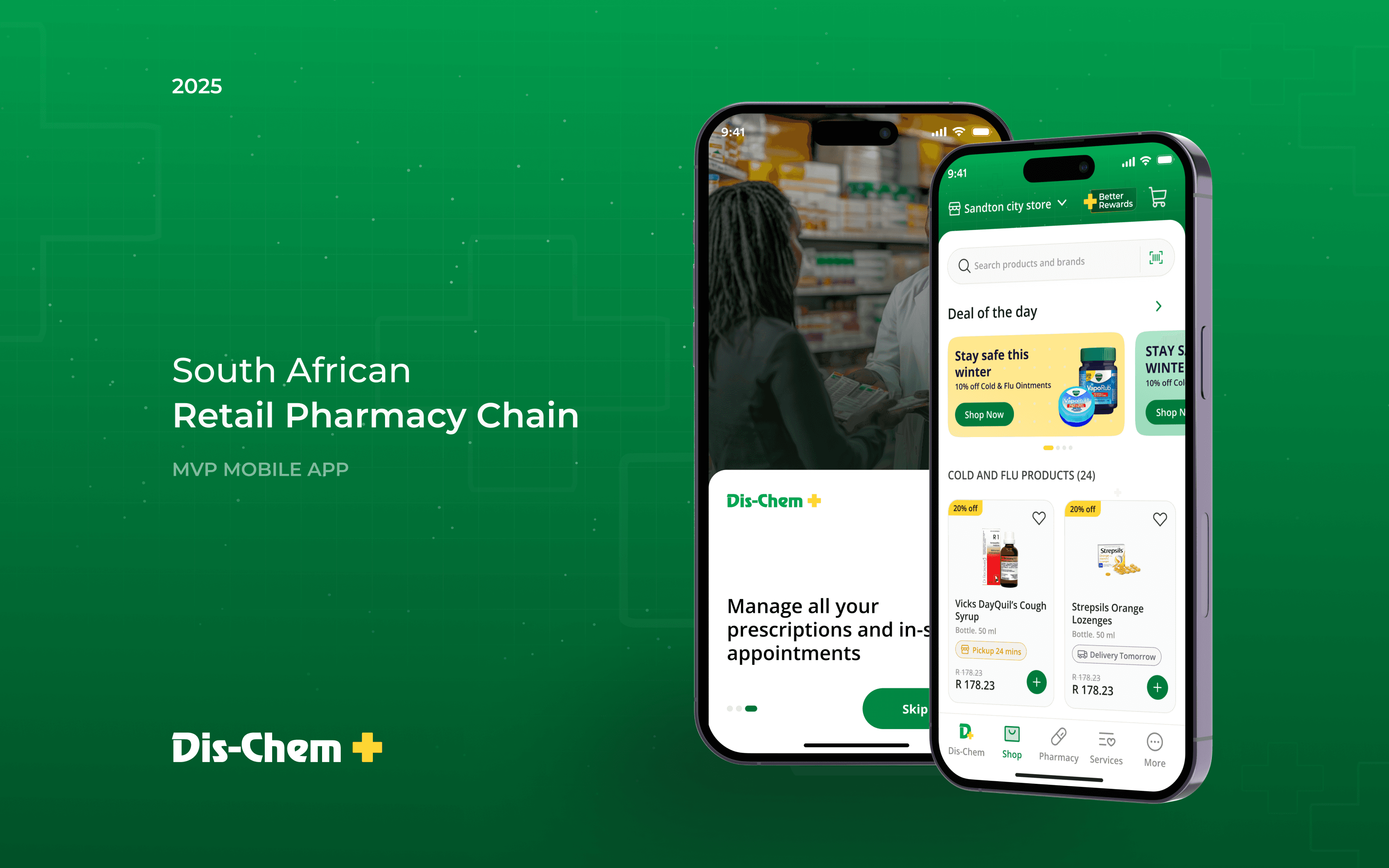
The objective was to create an MVP revamp of the existing Dis-Chem mobile application that could be presented to senior leadership for buy-in and future investment.
The focus areas included:
Addressing critical UX and usability gaps in the current app
Improving information architecture and navigation clarity
Enhancing overall visual polish without deviating from brand familiarity
Demonstrating how the app could evolve into a more modern, scalable product
Competitive Landscape
Dis-Chem operates in a highly competitive ecosystem that includes:
Local pharmacy chains
International healthcare retailers
E-commerce and quick-commerce platforms
Supermarket and delivery-first apps entering the health space
Understanding how these competitors balance trust, speed, accessibility, and digital convenience was critical to defining the future direction of the Dis-Chem app.

Our approach
Over the 2-month project period, we worked within a tight timeline and ran UI benchmarking and UX work in parallel. While one track focused on UI and competitor benchmarking, the other focused on information architecture, user flows, and navigation definition.
Although the brief was limited to an MVP, but we need to map out all core journeys upfront—including main navigation and the Better Rewards experience—to ensure the product felt cohesive, usable, and scalable for future phases.
This approach helped us move fast while building a strong foundation for long-term product evolution.
02 months
DURATION
02 months
DURATION

Benchmarking
Over the 2-month project period, we worked within a tight timeline and ran UI benchmarking and UX work in parallel. While one track focused on UI and competitor benchmarking, the other focused on information architecture, user flows, and navigation definition.

Benchmarking
Over the 2-month project period, we worked within a tight timeline and ran UI benchmarking and UX work in parallel. While one track focused on UI and competitor benchmarking, the other focused on information architecture, user flows, and navigation definition.

Style guide & Components
Over the 2-month project period, we worked within a tight timeline and ran UI benchmarking and UX work in parallel. While one track focused on UI and competitor benchmarking, the other focused on information architecture, user flows, and navigation definition.

Style guide & Components
Over the 2-month project period, we worked within a tight timeline and ran UI benchmarking and UX work in parallel. While one track focused on UI and competitor benchmarking, the other focused on information architecture, user flows, and navigation definition.


Style guide & Components
Over the 2-month project period, we worked within a tight timeline and ran UI benchmarking and UX work in parallel. While one track focused on UI and competitor benchmarking, the other focused on information architecture, user flows, and navigation definition.


Prototype & Micro Interaction
To bring the MVP closer to a real-world experience, we introduced micro interactions and motion cues during the prototyping phase.
These interactions focused on:
Providing reassurance during critical moments like payment and order confirmation
Clearly communicating order status through progressive updates
Reducing anxiety in delivery-related journeys
The prototype demonstrates:
Payment completion feedback
Order placed confirmation
Real-time order status progression
This helped stakeholders and real users at the client’s end experience the flow, not just review static screens, making the MVP more tangible and testable.
Subscription Model – Better Rewards
Dis-Chem’s Better Rewards program was already in place. The challenge was that the value and benefits of the program were not being communicated clearly within the app, which limited user awareness and usage.
Our work focused on redesigning the experience so users could better understand what Better Rewards offers, easily discover ongoing benefits, and use their rewards seamlessly while shopping—without changing the existing business or subscription model.


Thanks for watching!
Due to the confidentiality and non-disclosure agreement (NDA) associated with the project, more visual representations cannot be shared in this public forum.
If you would like more details about the project,
please feel free to Get in Touch